
A playful studio, several ways to take part
Project Joy Studio brings creativity into everyday life through workshops, studio experiences, and take-home kits. During my internship, Fei and I worked on a website redesign to help visitors understand these offerings while expressing the studio’s welcoming, experimental character.
Different visits began with different questions. An organization planning a team activity needed practical details. A family exploring a private workshop needed to understand the experience. Someone browsing public workshops needed an event to consider.
Our challenge was to make those paths recognizable without losing the studio’s sense of play.
My role in a two-person collaboration
I worked with Fei, primarily focusing on UI design and code implementation. We collaborated on the project; the research and planning materials below provide the team’s context rather than representing an individually owned research program.
My focus was turning the site direction into page layouts, visual treatments, and WordPress implementation work. The archive includes successive Figma versions and PHP templates for the home page, events, private experiences, and other areas of the site.
Primary contribution: UI design & code
Status: design and implementation work completed to the documented stage; the project did not launch.
Understand the content before styling it
The project materials included an audit of the existing website, audience profiles, competitor references, a site map, and task flows. The audit called attention to uneven navigation, weak type hierarchy, and inconsistent use of color.
The audience work considered corporate teams and wellness organizers alongside families and individual visitors. Competitor references included ARTrageous Brush & Flow, Pinot’s Palette, and Colorsnack. Together, these materials framed questions about how to explain an activity, show group suitability, and guide an inquiry.
These documents informed design exploration. They do not establish a completed usability study or validated audience segments. I used them as context for the interface, keeping the distinction between proposed needs and observed behavior clear.
01 / Give each kind of visit a clear entry
The Events & Workshops page groups the experience into corporate team-building, private parties, public workshops, and past events. Named visual cards give visitors a starting point based on what they are trying to arrange or explore.
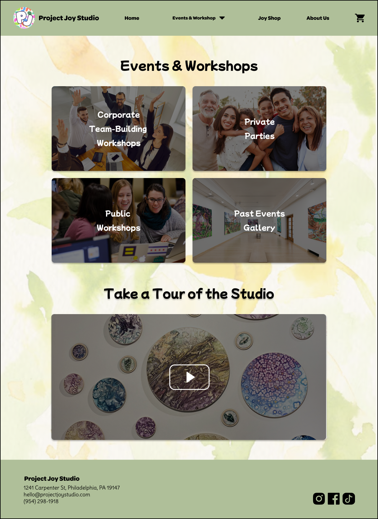
The cards combine a recognizable label with imagery rather than relying on a decorative layout alone. The shared navigation keeps events, the shop, and studio information available across pages.
The trade-off: several entry points help separate intentions, but their labels still need to match how people think. I would test whether a family gathering or an organization’s private event finds the intended route before assuming that the grouping is self-explanatory.
02 / Answer planning questions in a useful order
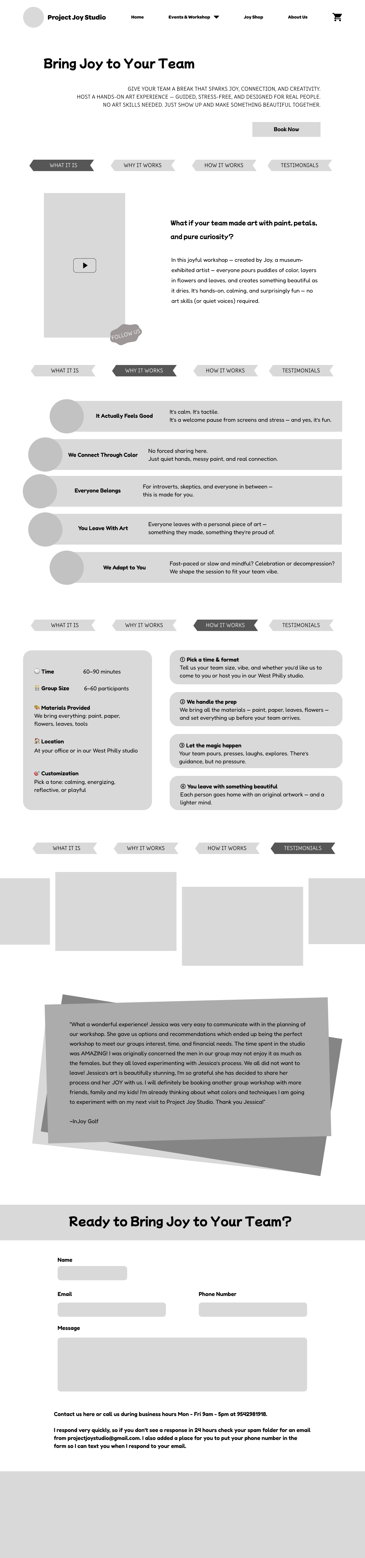
The corporate page develops from a broad invitation into practical information: what the activity is, why a team might choose it, how it works, and how to get in touch. Section navigation makes the long page easier to move through.
The low-fidelity layout established that structure before the higher-fidelity design added watercolor textures, imagery, and stronger visual treatments. The planning section brings together duration, group size, location, materials, and customization alongside the activity steps.
Structure / Low fidelity
Expression / Hi-Fi 2
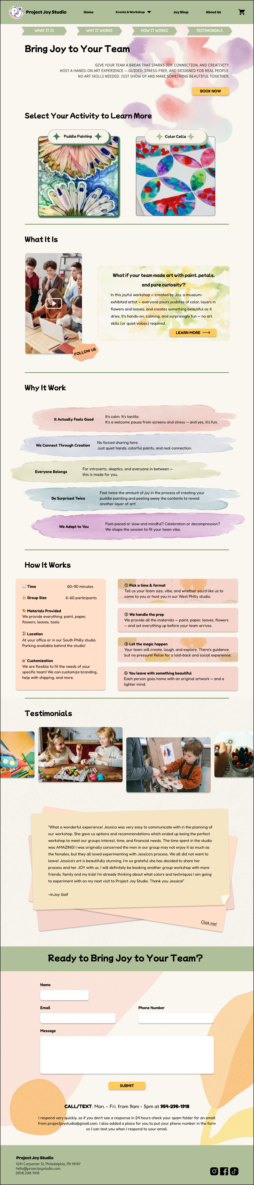
My UI focus: establish a readable sequence, distinguish the planning facts from explanatory text, and make calls to action recognizable within a visually rich page.
The trade-off: a detailed page can answer more questions, but it can also become difficult to scan. I would validate the section order with a task such as finding whether an activity fits a team’s size and location.
03 / Let the brand support the content
The later designs use soft paper-like backgrounds, watercolor marks, rounded shapes, and playful typography to reflect the creative activities. A consistent green navigation and footer frame the more expressive content between them.
The private-experience page uses activity steps and visual examples to explain what a visit involves. Its composition shares the corporate page’s visual language while adapting the content to a different context.

For me, the important UI question was where that expression helps: a paint-like section treatment can establish character, but the title, body text, and action still need a clear hierarchy.
Looking back, I would give contrast, small text, and mobile reading more explicit checks. The existence of desktop, tablet, and mobile styles in a design file does not by itself prove the experience works across devices.
From Figma direction to WordPress templates
I also worked on the code implementation. The project repository contains PHP templates for the home page, events, private experiences, past events, and studio information, together with shared header and footer files.
The code uses WordPress template functions to connect page structure and theme assets. That provides a concrete record of implementation beyond exported mockups.
The shared header defines navigation styling, fonts, and theme assets, while page templates carry the individual experiences. This is the stage where layout, typography, content length, and reusable patterns have to work together in the browser.
Explore the project code ↗The repository documents work in progress. This case study does not present the site as deployed, client-approved, or fully tested. Forms, commerce, and other backend behavior have not been verified as production services.
What we delivered — and where it stopped
The project produced a design progression from wireframes through higher-fidelity pages, supporting UI styles and components, and a WordPress codebase. My main contribution was UI and implementation within the collaboration with Fei.
The project did not launch. I do not have production analytics or evidence of changes in inquiries, bookings, or sales, and I would not treat the existence of a finished-looking design as proof of those outcomes.
The work I can show is the design reasoning and its expression in pages and code: differentiated entry points, a structured workshop page, and a consistent visual direction.
What I would take into the next project
Validate the most important route early. Before polishing every page, I would ask representative visitors to find an appropriate workshop and identify what they still need to know before contacting the studio.
Review one complete page in the browser sooner. A vertical slice from navigation through inquiry would expose content, responsive, and implementation constraints while the design is still flexible.
Define what “ready” means. For a future launch, I would agree on ownership, content readiness, functional checks, and acceptance criteria with the people involved. This project’s documented endpoint is design and implementation work, rather than a released service.