
A shared home for a student-run music company.
Mad Dragon Music Group brings together Mad Dragon Records and MadKo Concerts. Its artists, events, and updates were spread across channels. The team needed a responsive website that visitors could navigate and MDMG could maintain.
My contribution
UX Lead; contributor to research, UI design, and the user-story video. I also developed event browsing, responsive navigation, and the footer in WordPress.
Shared team work
Research, prototype iterations, and visual refinement with Rocky Arcaro (Project Manager) and Joe Chindemi (Development Lead).
The focus of this case: how feedback changed event discovery, and how I carried that direction into implementation.
Use feedback to choose what matters.
Stakeholder discussions, competitor reviews, and an interest survey informed our audience profiles and task flows. Music discovery and mobile use became priorities.
Prototype surveys across desktop, tablet, and mobile surfaced three recurring concerns: finding event details, dense or inconsistent text, and music/social links that were easy to miss.
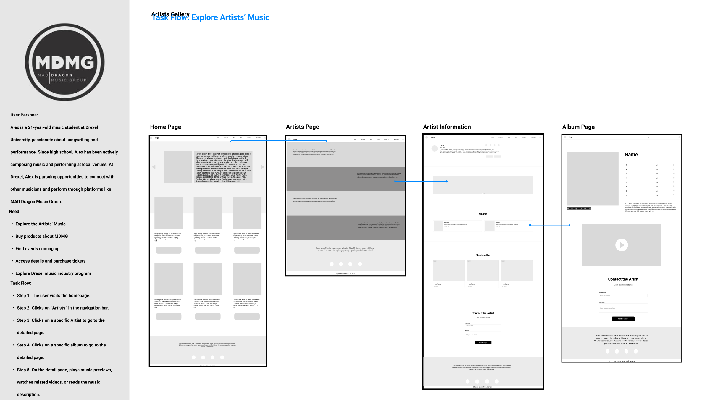
The feedback gave us concrete decisions to work on, rather than a reason to add more features.
Watch the team’s user-story video
I contributed to this team artifact alongside the research and UI work.
01 / PRIORITIZATION
Make the event list the first view.
What we heard
Some respondents missed ticket actions or found the calendar too dominant. MDMG also preferred a list as the default.
What we changed
Prioritize the event list, with performer, venue, and times beside the ticket action. Keep the calendar available for browsing by date.
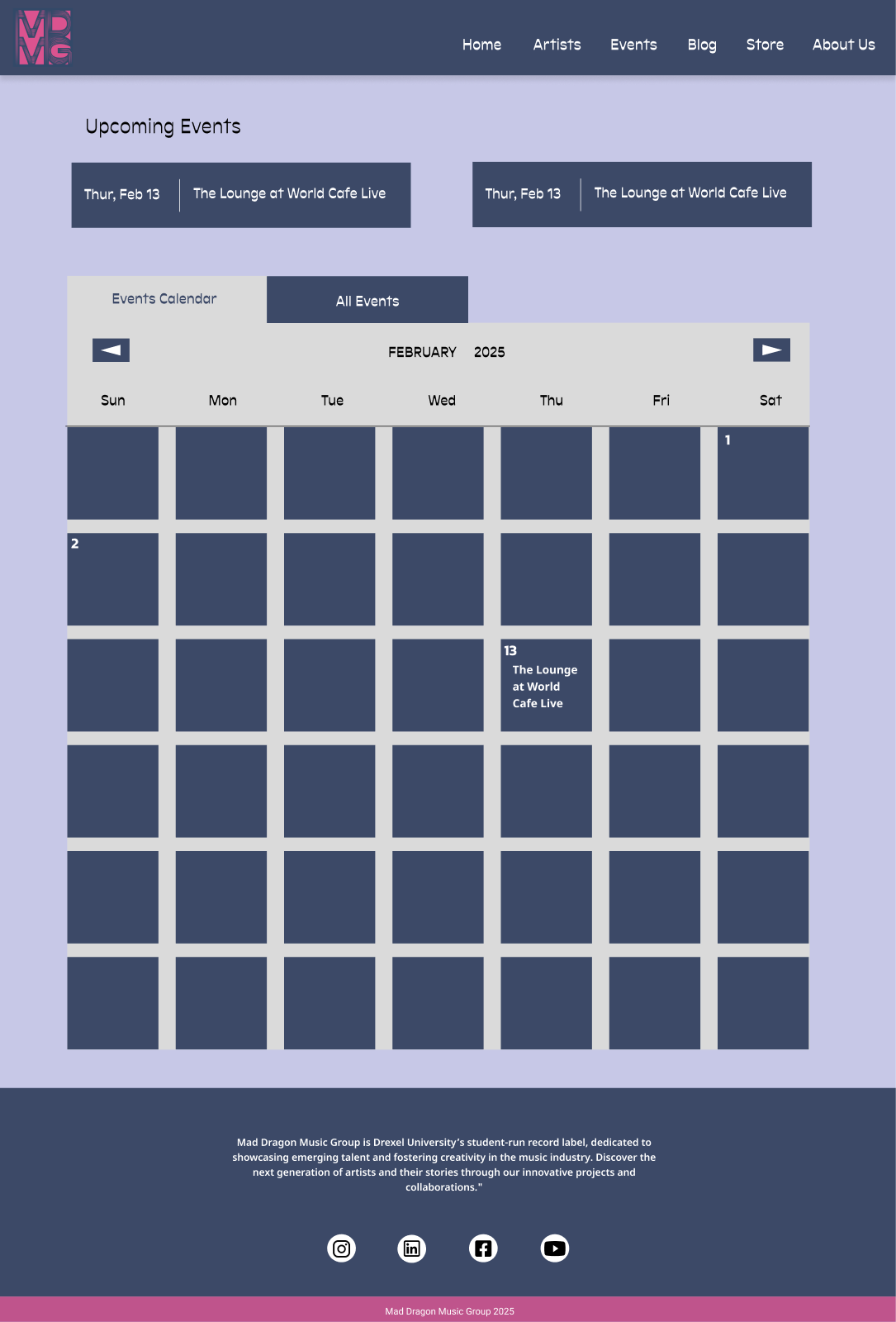
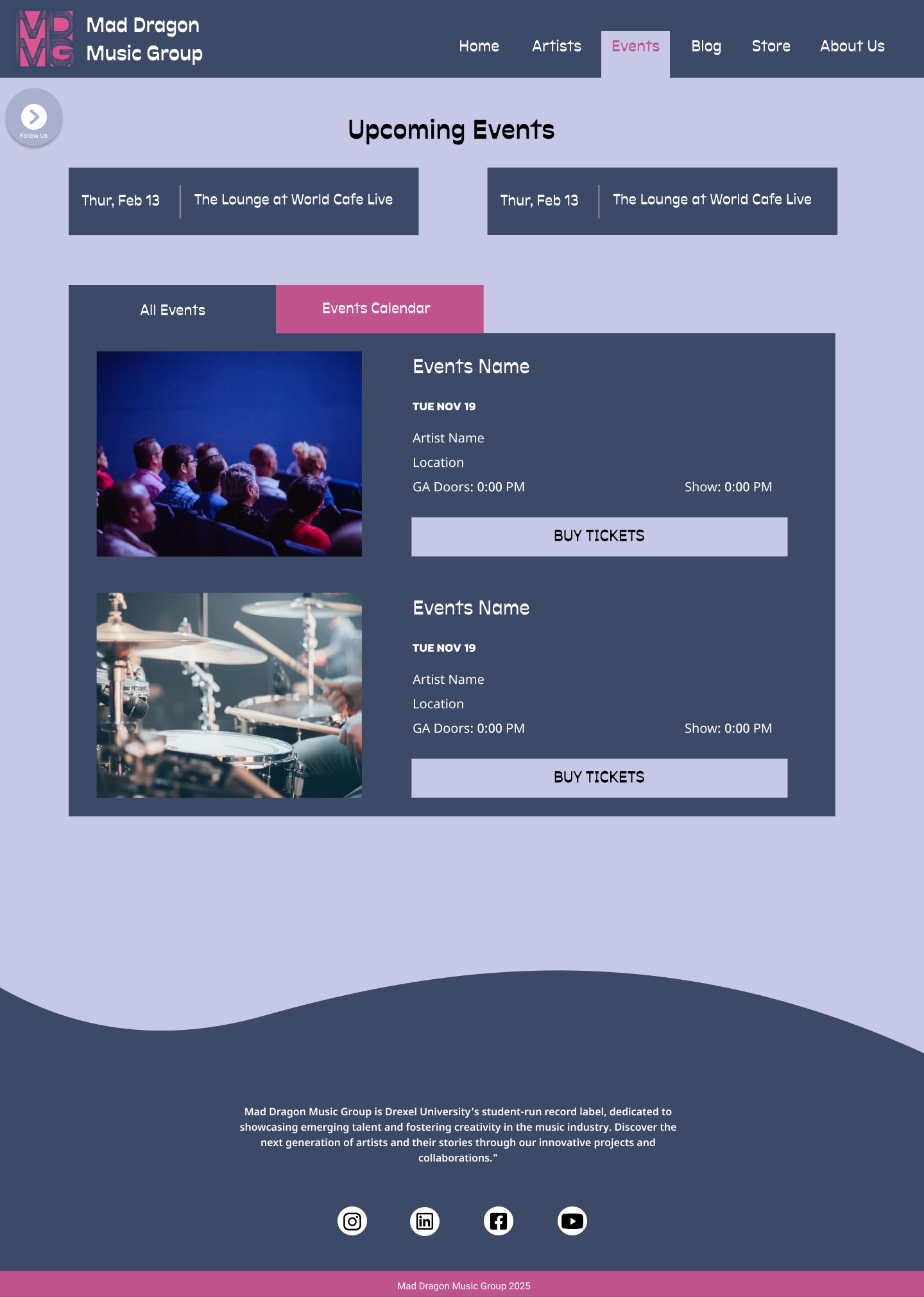
The trade-off: the calendar helps date-based planning; the list exposes more useful information when only a few shows are scheduled. We kept both views, changing their priority.
02 / MY IMPLEMENTATION
Carry the event flow into WordPress.
I built the event overview, calendar, and detail views, together with the responsive navigation and footer. Event entries and custom fields connect the list to content such as images, artists, venues, and show times.
The intended journey is simple: browse a show → review the details → continue to the ticket provider. MDMG presents the event; the third-party provider handles purchasing.
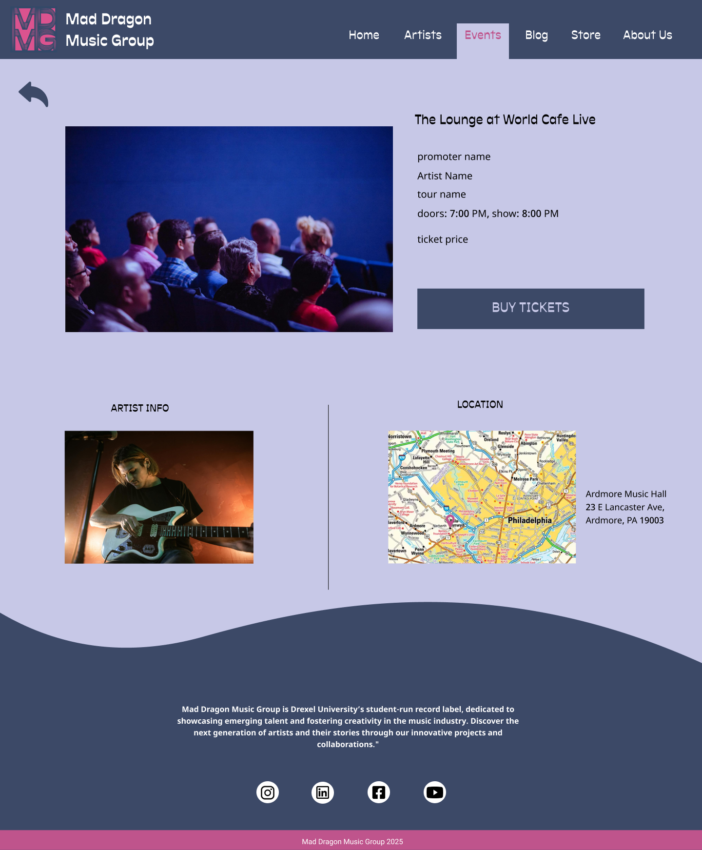

This connects the design to maintainable content, rather than creating a separate hardcoded page for every show.
03 / COLLABORATION & SCOPE
Make the system clearer—and keep it maintainable.
Low-fi feedback asked for easier music access; MDMG wanted social channels to be more visible. Artist profiles place music and social links near the artist’s name.
Mid-fi feedback and critique also exposed inconsistent type, spacing, and components. We refined font sizes, grid alignment, and shared styles across device layouts.
We paused a proposed student archive when MDMG could not confirm access to its content. A useful site needed information the organization could actually supply and update.
What I delivered. What I would improve.
The team completed the responsive design and development project. My contribution linked UX planning with the implementation of event pages and shared navigation. The project did not launch.
The work is supported by prototype responses, design iterations, team check-ins, and code. There was no final comparison study establishing how much the revised flow improved.
My next iteration
Bring the action closer. The mobile event detail gives a large image substantial space before the ticket button. I would reduce that image and test a more immediate ticket action.
Validate the complete handoff. Replace sample event content, check selection-state contrast and tap areas, and ask visitors to find a show and continue to its ticket provider.